Snow-by-Night Redesign - Colors

Snow-by-Night Preview 2
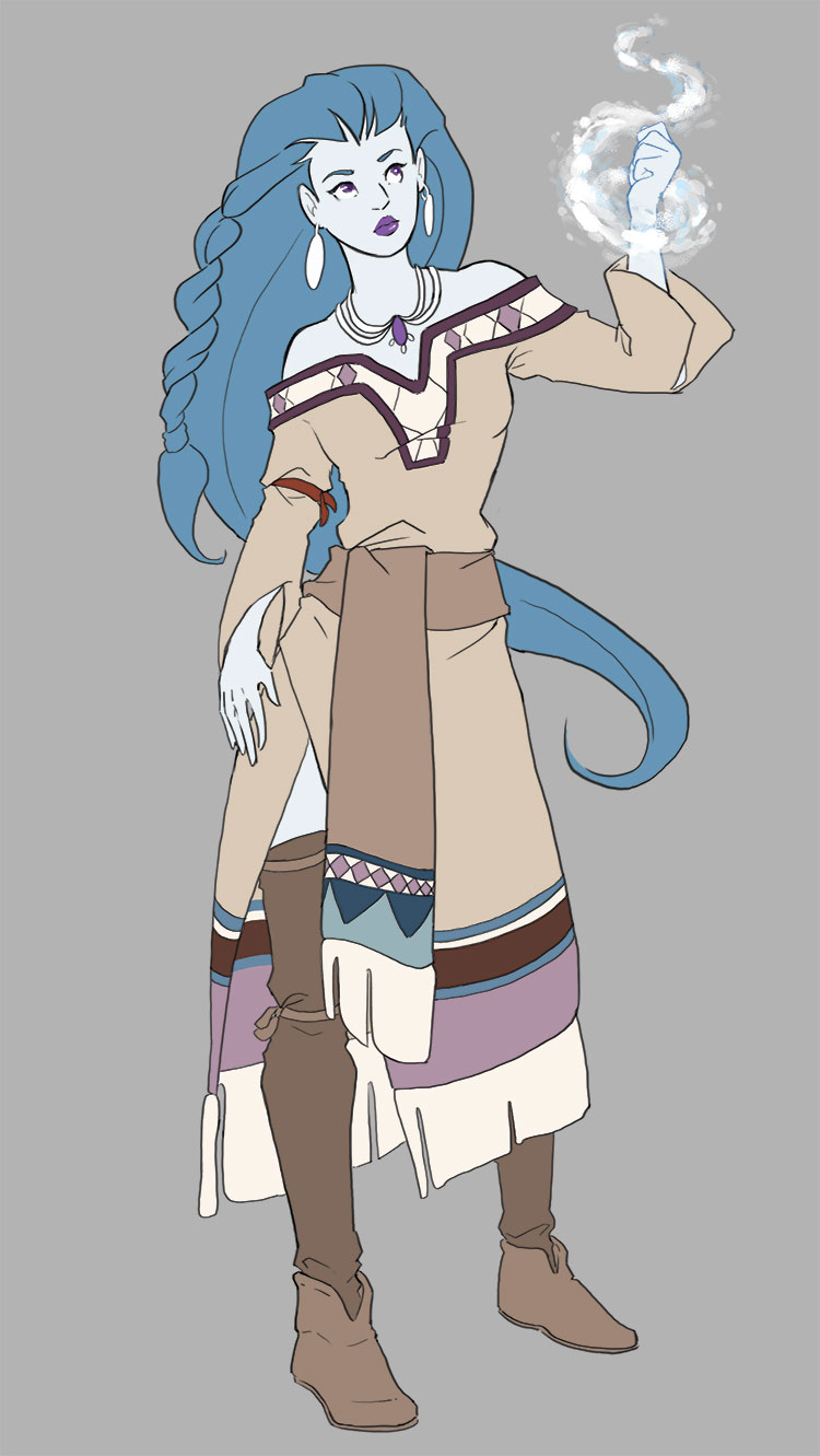
May 20th, 2014Tonight’s hiatus update is the second preview of Snow-by-Night’s redesign, showcasing Naty’s colors. The team spent a lot of time on this color choice, and I really think it shows. Even if Snow-by-Night doesn’t look impressed in this shot. Let us know what you think in the comments!


Hi everyone. I’m back from California. Thank you all for taking a look at our concept sketches for our new characters, particularly Snow-by-Night. The purpose of this particular sketch was to get the colors down for conformity through the comic. It’s just the flats with no shading. Naty will be adding highlights and shading when doing the pages. Thank you all for the feedback. We’ll take it into consideration as we prepare to relaunch at the end of June.
So… long… to wait!
On topic, I’m giving myself some hours of sleep before commenting on Snow.
We’ve got a different artist, so a different look and feel. Maybe you’ll like it better, maybe not. Whatever your preference, it will still be a great story.
Take a look at Snow’s face in the last preview, the uncolored one. Just substitute it in for this one. It has a great deal of expression, and it looks like the face of a mature woman. It is very beautiful.
My only problem is with the eyes. They don’t look like the preview before, and they don’t look correct, particularly the left eye. I feel the previous preview looked great, though.
I wish I didn’t have to say this but Snow By Night’s redesign is AWFUL. her face – it looks so amateurish – like someone who just this year learned to draw properly but still hasn’t grasped any defining facial characteristics…she was WAY better before. sure, there’s something more TECHNICALLY accurate now, but she’s lost ALL depth, feeling, uniqueness. TERRIBLE.
“but she’s lost ALL depth, feeling, uniqueness” … you mean that’s NOT deliberate cause of the loss of aether she endured?
I must say I’m not sure if her looking worse in this picture is due to lack of shading or something else, but she does look worse. Also more human.
I wouldn’t say it’s a terrible face, nor an awful one. It’s just… so bland. I don’t know how to properly put it, but she’s too smooth-looking, she looks like she lost her wild side. In itself, it’s not a bad design (even though her hair line seems a bit too high), but it’s not Snow By Night I see when I look at her.
I think one of the reasons she doesn’t look like herself is because her face is rounder with bigger eyes, making her look younger, less mature.
Her clothes are quite nice, though.
As hchano said above, check out the expressions that will be posted on Friday and see if that makes her appear more in character! Though, keep in mind that the events of Chapter 8 have left significant changes on our main cast.
You sure that’s not just her neutral expression in this pic :o? Maybe the expression sheet (I assume they did one!) will fix that for you. I will miss Snow’s old bangs tho! These pulled back ones will def not my fave part, but that’s personal preference…I think it works with the rest of the outfit here~
Oh, haha, it’s definitely meant to be a neutral expression, not one of dislike, I was just amused by the fact that Snow-by-Night is so often unimpressed with things that would have most (human) people excited. Like staring at a hand made of snow with magical ice powers. :P
I’m repeating myself here, but please check out the expressions that will be posted on Friday and see if that gives her the depth you’re looking for. These are all sketches and flat colors – I think you’ll be pleasantly surprised to see how Snow-by-Night looks in an actual comic page. Also keep in mind that the events of Chapter 8 have left significant changes on our main cast.
Everyone is forgetting that this is a just a reference sketch, a flat sketch where the artist is just trying to tweak colors and costume. Basically, it’s just an idea, not the finished product. :P
Seconding the earring thing. Seems like the amethyst should carry to the earrings too. I love everything else tho! This one looks very Native American. Kinda wanna see her with feathers in her hair haha! Good work guys, lookin forward to mathilda :9
I was laying in bed trying to sleep and suddenly thought instead of the amethyst, maybe an ivory colour (similar to the fringe) would work better instead XD still contrasts the hair and keeps to this design but would differentiate from the skin and keep in with the whole natural look. Just my 2¢ :’D
I think it’s beautiful: the colors are all cold in tone that work with her, except for the tan, which makes me feel like she’s a bit uncomfortable to be looking “human”, which is probably what you were going for :P Not sure why, but the earrings being white really throw me off though, it looks like they blend in with her face.